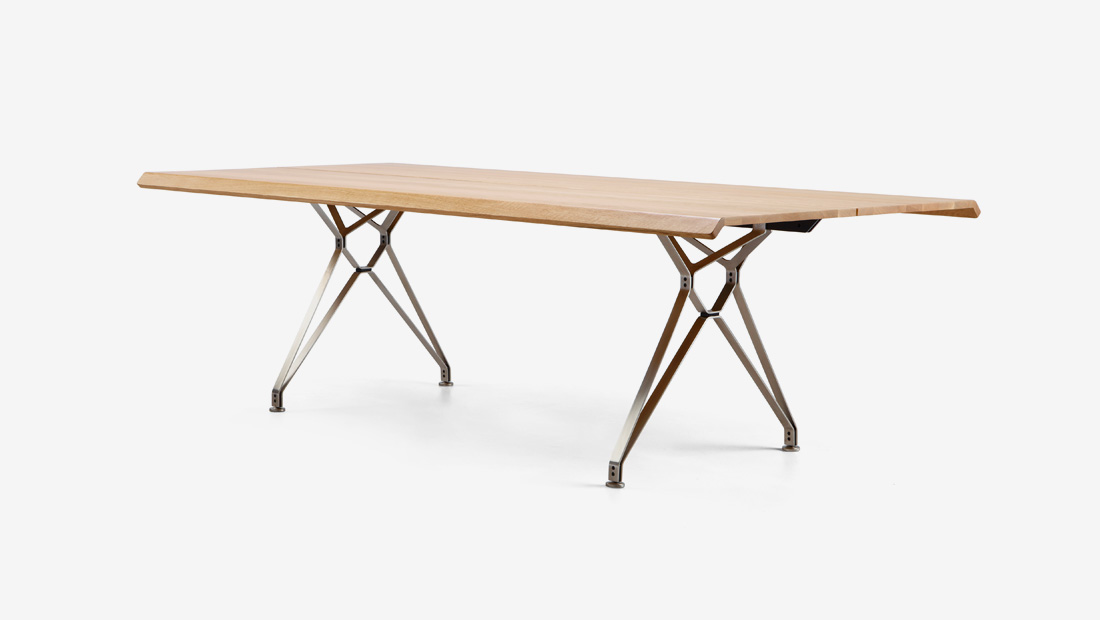
 Make those everyday moments special with the Fiord Table, now available with a solid timber top for indoor dining.]]>
 Make those everyday moments special with the Fiord Table, now available with a solid timber top for indoor dining.]]>
 Make those everyday moments special with the Fiord Table, now available with a solid timber top for indoor dining.]]>
 Make those everyday moments special with the Fiord Table, now available with a solid timber top for indoor dining.]]>
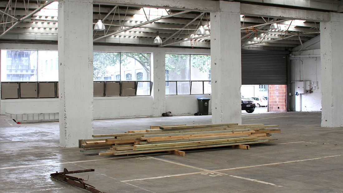 Renovations have begun on our new Offices, Showroom and Warehouse in Parnell, opening late 2013. Stay tuned for progress.]]>
 Renovations have begun on our new Offices, Showroom and Warehouse in Parnell, opening late 2013. Stay tuned for progress.]]>
Mail can be sent to: PO Box 99195, Newmarket, Auckland 1149.
Invoices and Statements can be sent to: accounts@imo.co.nz.
Samples can be viewed by appointment at: 30 Kenwyn Street, Parnell, Auckland or please contact to arrange delivery.
Courier parcels can be sent to: 30 Kenwyn Street, Parnell, Auckland 1052.
 In the midst of Karanga Plaza in Auckland’s Wynyard Quarter is a stack of old shipping containers housing an information kiosk. The Karanga Kiosk is the place to go for information and to learn about the area’s history, future developments and upcoming events.
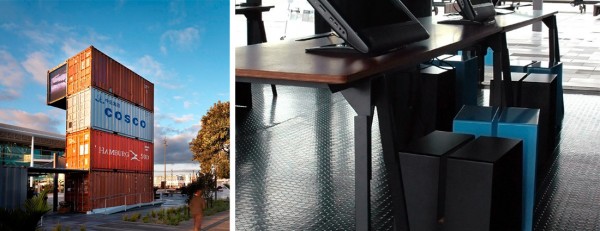 Designed by Architectus, Karanga Kiosk is a nod to the maritime and industrial heritage of the area.The structure has two elements – a ‘pavilion’ and a ‘tower‘. Pull up an A2 stool inside the pavilion to explore the interactive display screens at the custom designed trestle tables made by IMO. The cantilevered container at the top of the tower accommodates animated screens that create a way finding beacon for the Quarter and keep visitors up to date with what is going on.
Visit Waterfront Auckland to find out more.]]>
 In the midst of Karanga Plaza in Auckland’s Wynyard Quarter is a stack of old shipping containers housing an information kiosk. The Karanga Kiosk is the place to go for information and to learn about the area’s history, future developments and upcoming events.
 Designed by Architectus, Karanga Kiosk is a nod to the maritime and industrial heritage of the area.The structure has two elements – a ‘pavilion’ and a ‘tower‘. Pull up an A2 stool inside the pavilion to explore the interactive display screens at the custom designed trestle tables made by IMO. The cantilevered container at the top of the tower accommodates animated screens that create a way finding beacon for the Quarter and keep visitors up to date with what is going on.
Visit Waterfront Auckland to find out more.]]>
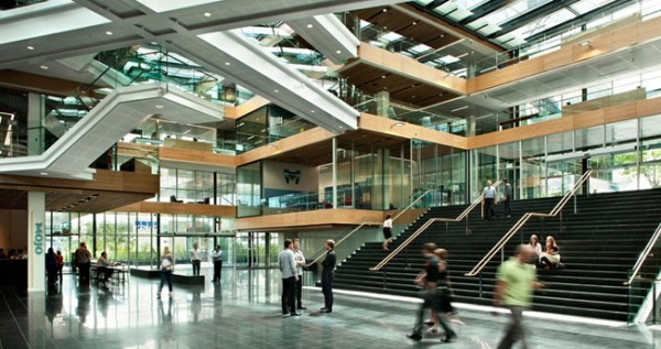
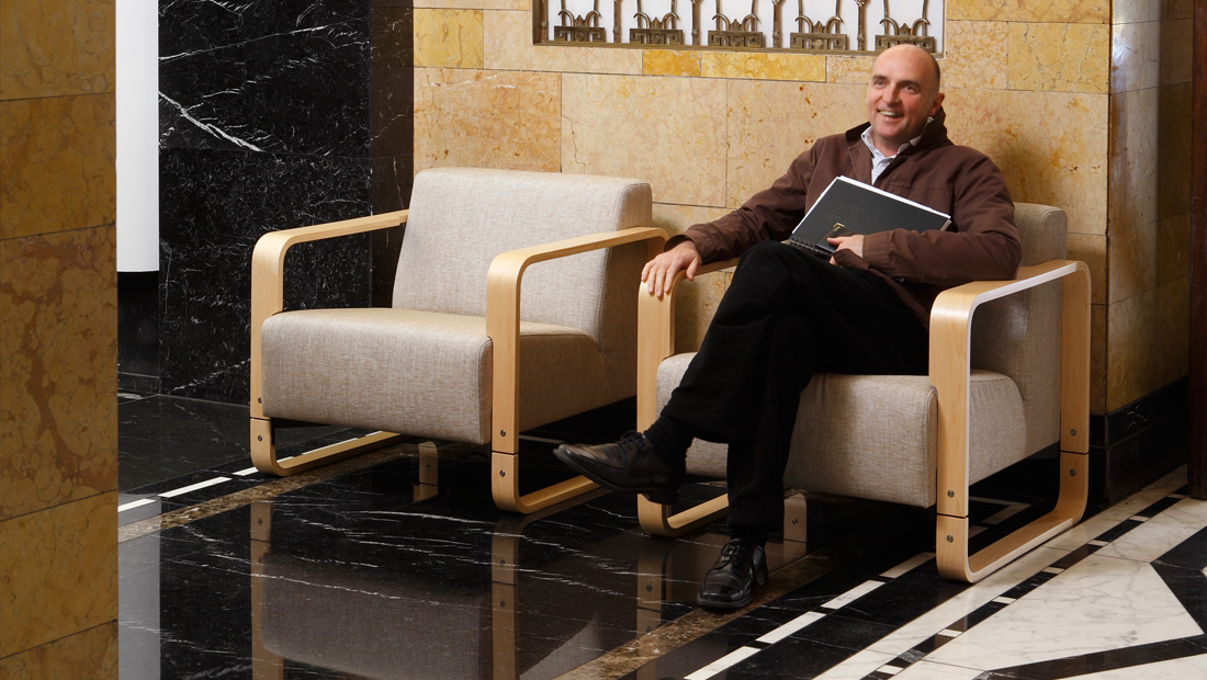 Architect Patrick Clifford, Director of award winning practice Architectus, past President of the NZIA, a member of Auckland Council’s Urban Design Panel and an instrumental figure in the transformation of Auckland’s CBD streetscapes and Wynyard Quarter. We talk to Patrick about his role as design leader and the base build of Telecom’s corporate headquarters. The 29,000 m² five green star office campus in central Auckland is New Zealand’s biggest single tenant office building, housing more than 2500 people. Architectus have designed a group of four low rise buildings connected by a central light filled atrium. Telecom Place is one of the first new buildings to be designed under the Victoria Quarter plan; the Councils new vision for the CBD’s dynamic western fringe.
 As lead designer, elaborate on your role in the design of Telecom Place.
None of these projects are done by one individual. Sometimes you work in isolation, but relatively speaking the concept takes about a minute and the rest of it takes about five years. So you do have to ensure that it has been pretty well thought out at the start. There were significant commitments into this project by lots of other people at all stages. Within the office it’s a collegial, collaborative thing. People have their own interests and aspirations and so on – and there is a challenge in that too.
How do you articulate Architectus’ principles and views internally?
You will often hear around the office something like “we don’t do it that way” (laughs) or “we do it this way” – we don’t really hold back on that one. This is not a laissez faire environment, we’ve got a collective view and that’s what we’re doing. We also do this through material we have published. We have made a pretty significant commitment to publishing, so you can pick up a book – it’s written down, recorded and tells you what our values are.
From what I understand, the Telecom project was originally envisaged as four separate buildings?
The site covers a whole block, so we thought it would be more appropriate to organise it into four elements rather than one big piece. It was important that it was in scale with the surrounding buildings. One of the approaches was to make those four pieces similar but not the same. That worked with the contours too – a very nice thing about the site is that it slopes. It seemed to make sense to push those four pieces to the corners, which would define the street edges and that would leave a little network of space in between the four elements. Our original thinking was that the space in between would have been open, a lane way that would work its way through there. When Telecom signed on as the Tenant they simply said, “That would be great, we’d just like to be able to join them up. We like the idea that there are four elements, but we’d like to be able to connect the people up without having to go outside.” We thought we should make a hierarchy of spaces, so the lowest floors were the most connected and the upper floors the most disconnected, more pavilion like at the top. We thought over time it would be helpful to have some floors that were completely disconnected. The lowest two or three floors are well connected and as you go up the atrium starts to get smaller, so only the corners connect, then when you get to the top it is not connected at all.
Tell us about the buildings relationship to the street.
You are bringing a lot of activity into the interior but you still want and need to have a street relationship which is really challenging. Each street edge is slightly different. We wanted some things that you entered off the street as well as through the interior space. We made a deliberate entry for the retail store off the corner of Victoria Street and changed the scale. When it was decided that Telecom would be the tenant we introduced the entry on Hardinge Street. It is actually quite a lovely street with those Plane trees and has a nice North East aspect, but it was an undiscovered one. We reconfigured all of those buildings to give back some open space, somewhere where anyone could sit; it gives a sense of generosity back to the street. Once you’ve got four elements of course, it then presents issues like identity – are they alike, the same, different, do they have different tones or colours? In the end we decided on three light and one dark, the darker one has a little more weight, it was differentiated, rather than completely different. The façade system we developed was quite prickly on the outside – all those sun shades were coloured and toned and coded. We do have a propensity for a few vertical fins on our jobs, it’s not finished if we haven’t got some of those! The other thing I really enjoyed on those street edges is the canopy. The canopy steps up and down, it orders the four elements together in terms of the street and the sloping site. We wanted it to be quite grand at various times. Canopies are meant to be between a certain height and even though they aren’t required in the Victoria Quarter district plan it then didn’t comply which caused some planning consternation. Common sense eventually prevailed there, which is where the process of the Urban Design Panel is very helpful in that regard, they offer a rational view.
What impact did the Victoria Quarter plan have on the building?
We were going through the process of gaining resource consent and had proceeded down the pathway of the Urban Design Panel when the Victoria Quarter plan changed. It now has a bigger urban agenda, it’s got to do with scale, it’s the way in which you treat the buildings in context, their relationship to the street, their edges. The street edges need to have a certain percentage of glazing, they require a certain percentage of retail for street activation and so on. Ground floor space in all new buildings fronting the street has to have a minimum floor to ceiling height of 4 metres. This gives a robust possibility for retail and other uses over the long term but it made quite interesting height relationships because of the stepping in the site – 4 metres on one side meant it was 3.6 metres on the other. At times for the promoter of the building it becomes “how on earth is this thing going to happen”. But if you don’t have some aspirations and rules nothing good ever happens. The Victoria Quarter plan change is quite powerful. It has got tools in it to influence what happens, and this was one of the first projects to happen under the new changes.
Click here to find out more about the Victoria Quarter Plan.
How does the Urban Design Panel work?
It’s an advisory group, lots of people sit on it – members from the architectural and landscape profession, urban designers and property managers, etc. I suppose why one talks about it, is that when you’re doing these projects the panel becomes a bit of a focus, it puts a stake in the ground along the way, “right we’ve been to the panel”, now we can do this. Even though it’s an advisory group it becomes a significant reference point as you move along. As in any field but importantly for us, peer review and critique is very powerful, everybody takes that very seriously. I think it has been a very positive thing for Auckland. We’ve been involved with a lot of projects that have gone in front of the panel over the years and found it both challenging and rewarding.
Click here to find out more about the Urban Design Panel.
Do you think it stops or alters the kind of apartment developments like you see along the Nelson Street ridge?
I don’t think it stops them – it can’t determine everything that happens in the city and the city is a reflection of the aspirations of its community; it’s sort of axiomatic really. What I see though is a shift very much in Auckland’s aspirations; Auckland now has the desire to be a good city. The panel is important in that – the community realises it has to make a contribution. There have been lots of things that have gradually started to make people think “we want it to be better”. We were obviously involved in the Queen Street project, and that was pretty hard work, but it was a bit of a tipping point, over time you get an accumulation of people thinking “we need to do this”.
You are involved in the development of Auckland’s Waterfront. What impetus has the World Cup provided for this?
What was the last big event we had like this – we haven’t seen too many of these? So yes, they are an impetus to do things. But you don’t want to create a whole lot of things that don’t get used again, so really you should just develop great public space, something you will have forever. I don’t want to be overly optimistic, but I think there is quite an awakening that will occur. I don’t think it will stop after the rugby World Cup. We haven’t had very many things that are just for pleasure, like the Gantry at Wynyard Quarter. There are a lot of good things happening on the streets around here; Britomart, Darby Street, Fort Street – at ten or eleven at night it’s pretty lively down there now. There’s a whole range of things that will become part of a collection of open spaces. And Aotea Square, quite quietly – I actually really like using it.
Interview by IMO, September 2011
Click here to download the PDF of the full interview]]>
 Architect Patrick Clifford, Director of award winning practice Architectus, past President of the NZIA, a member of Auckland Council’s Urban Design Panel and an instrumental figure in the transformation of Auckland’s CBD streetscapes and Wynyard Quarter. We talk to Patrick about his role as design leader and the base build of Telecom’s corporate headquarters. The 29,000 m² five green star office campus in central Auckland is New Zealand’s biggest single tenant office building, housing more than 2500 people. Architectus have designed a group of four low rise buildings connected by a central light filled atrium. Telecom Place is one of the first new buildings to be designed under the Victoria Quarter plan; the Councils new vision for the CBD’s dynamic western fringe.
 As lead designer, elaborate on your role in the design of Telecom Place.
None of these projects are done by one individual. Sometimes you work in isolation, but relatively speaking the concept takes about a minute and the rest of it takes about five years. So you do have to ensure that it has been pretty well thought out at the start. There were significant commitments into this project by lots of other people at all stages. Within the office it’s a collegial, collaborative thing. People have their own interests and aspirations and so on – and there is a challenge in that too.
How do you articulate Architectus’ principles and views internally?
You will often hear around the office something like “we don’t do it that way” (laughs) or “we do it this way” – we don’t really hold back on that one. This is not a laissez faire environment, we’ve got a collective view and that’s what we’re doing. We also do this through material we have published. We have made a pretty significant commitment to publishing, so you can pick up a book – it’s written down, recorded and tells you what our values are.
From what I understand, the Telecom project was originally envisaged as four separate buildings?
The site covers a whole block, so we thought it would be more appropriate to organise it into four elements rather than one big piece. It was important that it was in scale with the surrounding buildings. One of the approaches was to make those four pieces similar but not the same. That worked with the contours too – a very nice thing about the site is that it slopes. It seemed to make sense to push those four pieces to the corners, which would define the street edges and that would leave a little network of space in between the four elements. Our original thinking was that the space in between would have been open, a lane way that would work its way through there. When Telecom signed on as the Tenant they simply said, “That would be great, we’d just like to be able to join them up. We like the idea that there are four elements, but we’d like to be able to connect the people up without having to go outside.” We thought we should make a hierarchy of spaces, so the lowest floors were the most connected and the upper floors the most disconnected, more pavilion like at the top. We thought over time it would be helpful to have some floors that were completely disconnected. The lowest two or three floors are well connected and as you go up the atrium starts to get smaller, so only the corners connect, then when you get to the top it is not connected at all.
Tell us about the buildings relationship to the street.
You are bringing a lot of activity into the interior but you still want and need to have a street relationship which is really challenging. Each street edge is slightly different. We wanted some things that you entered off the street as well as through the interior space. We made a deliberate entry for the retail store off the corner of Victoria Street and changed the scale. When it was decided that Telecom would be the tenant we introduced the entry on Hardinge Street. It is actually quite a lovely street with those Plane trees and has a nice North East aspect, but it was an undiscovered one. We reconfigured all of those buildings to give back some open space, somewhere where anyone could sit; it gives a sense of generosity back to the street. Once you’ve got four elements of course, it then presents issues like identity – are they alike, the same, different, do they have different tones or colours? In the end we decided on three light and one dark, the darker one has a little more weight, it was differentiated, rather than completely different. The façade system we developed was quite prickly on the outside – all those sun shades were coloured and toned and coded. We do have a propensity for a few vertical fins on our jobs, it’s not finished if we haven’t got some of those! The other thing I really enjoyed on those street edges is the canopy. The canopy steps up and down, it orders the four elements together in terms of the street and the sloping site. We wanted it to be quite grand at various times. Canopies are meant to be between a certain height and even though they aren’t required in the Victoria Quarter district plan it then didn’t comply which caused some planning consternation. Common sense eventually prevailed there, which is where the process of the Urban Design Panel is very helpful in that regard, they offer a rational view.
What impact did the Victoria Quarter plan have on the building?
We were going through the process of gaining resource consent and had proceeded down the pathway of the Urban Design Panel when the Victoria Quarter plan changed. It now has a bigger urban agenda, it’s got to do with scale, it’s the way in which you treat the buildings in context, their relationship to the street, their edges. The street edges need to have a certain percentage of glazing, they require a certain percentage of retail for street activation and so on. Ground floor space in all new buildings fronting the street has to have a minimum floor to ceiling height of 4 metres. This gives a robust possibility for retail and other uses over the long term but it made quite interesting height relationships because of the stepping in the site – 4 metres on one side meant it was 3.6 metres on the other. At times for the promoter of the building it becomes “how on earth is this thing going to happen”. But if you don’t have some aspirations and rules nothing good ever happens. The Victoria Quarter plan change is quite powerful. It has got tools in it to influence what happens, and this was one of the first projects to happen under the new changes.
Click here to find out more about the Victoria Quarter Plan.
How does the Urban Design Panel work?
It’s an advisory group, lots of people sit on it – members from the architectural and landscape profession, urban designers and property managers, etc. I suppose why one talks about it, is that when you’re doing these projects the panel becomes a bit of a focus, it puts a stake in the ground along the way, “right we’ve been to the panel”, now we can do this. Even though it’s an advisory group it becomes a significant reference point as you move along. As in any field but importantly for us, peer review and critique is very powerful, everybody takes that very seriously. I think it has been a very positive thing for Auckland. We’ve been involved with a lot of projects that have gone in front of the panel over the years and found it both challenging and rewarding.
Click here to find out more about the Urban Design Panel.
Do you think it stops or alters the kind of apartment developments like you see along the Nelson Street ridge?
I don’t think it stops them – it can’t determine everything that happens in the city and the city is a reflection of the aspirations of its community; it’s sort of axiomatic really. What I see though is a shift very much in Auckland’s aspirations; Auckland now has the desire to be a good city. The panel is important in that – the community realises it has to make a contribution. There have been lots of things that have gradually started to make people think “we want it to be better”. We were obviously involved in the Queen Street project, and that was pretty hard work, but it was a bit of a tipping point, over time you get an accumulation of people thinking “we need to do this”.
You are involved in the development of Auckland’s Waterfront. What impetus has the World Cup provided for this?
What was the last big event we had like this – we haven’t seen too many of these? So yes, they are an impetus to do things. But you don’t want to create a whole lot of things that don’t get used again, so really you should just develop great public space, something you will have forever. I don’t want to be overly optimistic, but I think there is quite an awakening that will occur. I don’t think it will stop after the rugby World Cup. We haven’t had very many things that are just for pleasure, like the Gantry at Wynyard Quarter. There are a lot of good things happening on the streets around here; Britomart, Darby Street, Fort Street – at ten or eleven at night it’s pretty lively down there now. There’s a whole range of things that will become part of a collection of open spaces. And Aotea Square, quite quietly – I actually really like using it.
Interview by IMO, September 2011
Click here to download the PDF of the full interview]]>

Visit Fisher and Paykel to find out how they are rethinking assumptions about kitchen design and creating appliances that will allow kitchens to be truly social.
]]>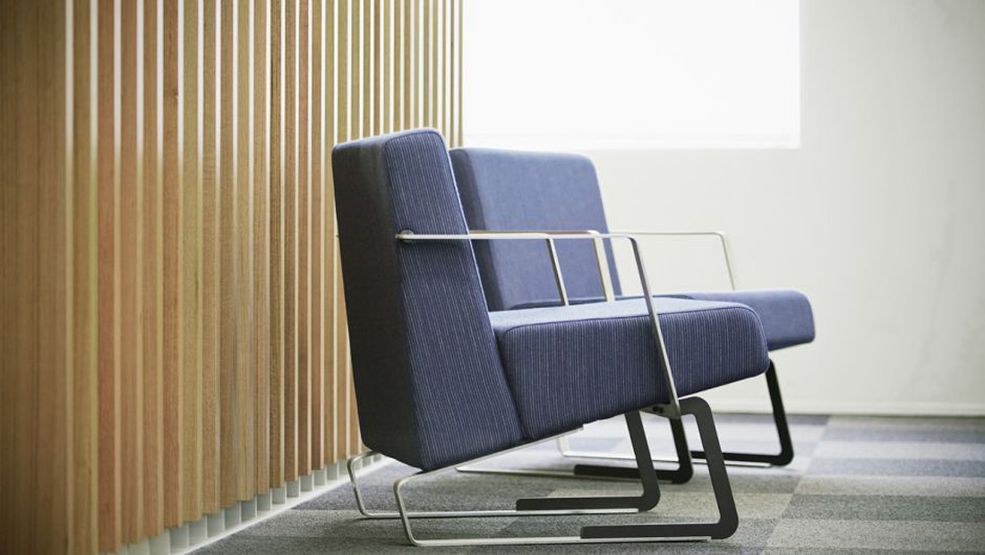 Take a seat on our Nelson Chair inside your local BNZ. The design of the new look stores for the 170 plus national retail fitout was a collaboration between Warren & Mahoney and Brand Specialist DNA.
Click here to visit Warren & Mahoney for further details.
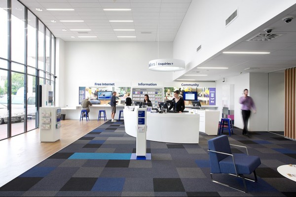 ]]>
]]> Take a seat on our Nelson Chair inside your local BNZ. The design of the new look stores for the 170 plus national retail fitout was a collaboration between Warren & Mahoney and Brand Specialist DNA.
Click here to visit Warren & Mahoney for further details.
 ]]>
]]>